
It was 2 AM. A startup founder in New York was staring at a broken production server, her entire e-commerce site down on the night before a sale launch. Her developer, three time zones away on the West Coast, sent one message: ‘Spinning up a Docker container. We will have it back in 10 minutes.’ They did. The right tools did not just save the business that night. They saved her sanity.
That story is not unusual. In 2026, web development is less about what you know and more about what you have in your toolkit. The global developer population has crossed 28 million, and the tools they rely on have become the scaffolding of the modern internet. Whether you are building your first portfolio site or scaling a platform to millions of users, these 10 tools are what separate a long night of debugging from a clean, confident deployment.
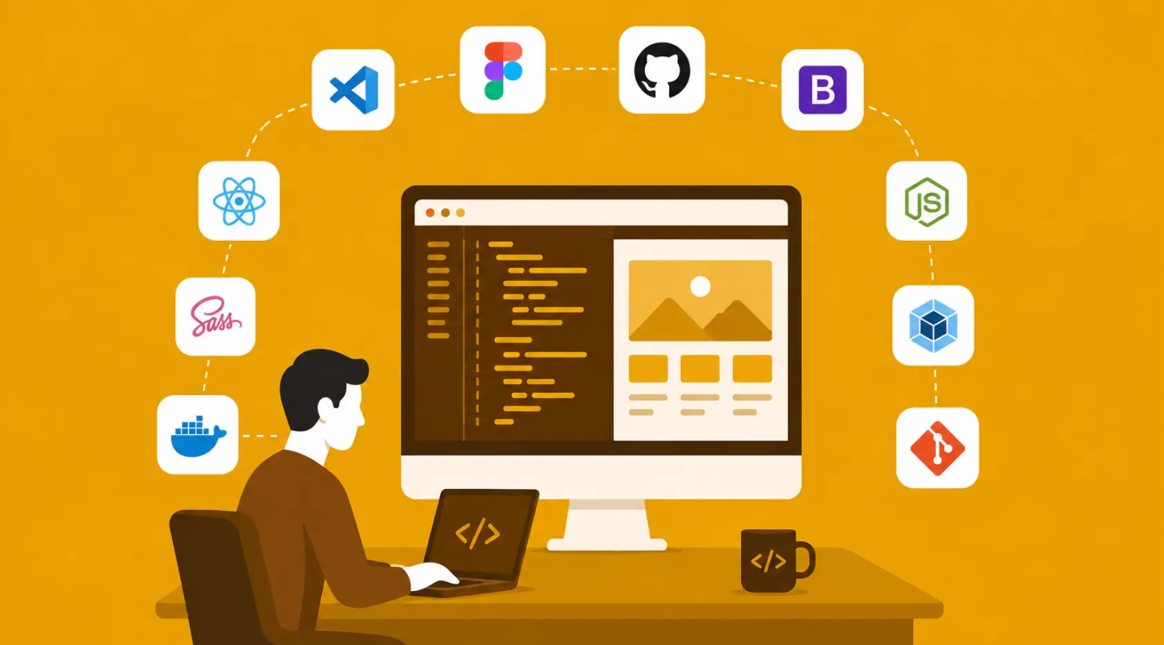
Here is a quick look at all 10 tools before we go deep on each one:
| Tool | Category | Adoption Stat | Core Strength |
|---|---|---|---|
| VS Code | Code Editor | ~73% of devs use it | Lightweight, extensible, IntelliSense |
| GitHub | Version Control Platform | 100M+ developers | Git hosting, CI/CD, collaboration |
| Figma | Design Tool | Used by 4M+ teams | Real-time collab, cloud-based prototyping |
| Bootstrap | CSS Framework | v5 powers 22% of sites | Mobile-first grid, pre-built components |
| Node.js | Server-side Runtime | ~6.3M npm packages | Non-blocking I/O, V8 engine speed |
| Webpack | Module Bundler | ~30M weekly downloads | Code splitting, hot module replacement |
| React | UI Library | ~40% of JS developers | Virtual DOM, component-based architecture |
| Sass | CSS Preprocessor | Used in 70%+ large projects | Variables, nesting, mixins |
| Docker | Containerization | Runs on 13M+ hosts | App isolation, CI/CD integration |
| Git | Version Control System | ~98% of dev teams | Branching, history tracking, merging |
1. Visual Studio Code (VS Code)
Picture a blank document and a blinking cursor. For most developers in 2026, that blank document opens in VS Code. Launched by Microsoft in 2015, it has grown into the editor of choice for roughly 73% of developers worldwide, according to Stack Overflow’s annual survey. That is not an accident.
VS Code is free, open-source, and so fast it feels like a native app even on modest hardware. But its real power is its ecosystem of extensions. Need to lint Python? There is an extension. Want AI-assisted completions? Install Copilot. Building a Vue.js app? There is a dedicated plugin for that too.
Key Features: IntelliSense code completion, built-in Git commands, integrated terminal, debugging support, and thousands of community extensions for every language and framework.
For beginners, it removes friction. For seniors, it bends to exactly how they like to work. That balance is rare, and it is why VS Code sits at the top of this list.
2. GitHub
There is a version of the internet’s history where every side project, every open-source library, and every startup’s codebase exists on scattered hard drives and USB sticks. GitHub ensured that timeline never happened.
Acquired by Microsoft in 2018 for 7.5 billion USD, GitHub now hosts over 420 million repositories and is home to more than 100 million developers. It is where code lives, breathes, and gets reviewed. Pull requests have replaced lengthy email chains. Issues have replaced sticky notes. Actions have automated what used to take a dedicated DevOps engineer.
Key Features: Git-based version control, pull requests and code reviews, GitHub Actions for CI/CD pipelines, GitHub Pages for free static site hosting, and access to millions of open-source projects.
If VS Code is where you write code, GitHub is where you ship it.
3. Figma
Before Figma, designers handed developers a folder of PNG files and crossed their fingers. The handoff was a ceremony of miscommunication. Figma changed that by making design a shared, real-time experience.
Launched in 2016 and now used by more than 4 million teams globally, Figma runs entirely in the browser. A designer in Chicago and a developer in Berlin can look at the same prototype simultaneously, leave comments on the same frame, and resolve feedback without a single email attachment.
Key Features: Real-time collaboration, responsive design tools, interactive prototyping, cloud-based access from any device, full version history, and developer handoff with CSS properties built in.
In 2026, a product that ships without Figma in the design phase is an outlier. The tool has become as essential to the web development pipeline as the code editor itself.
4. Bootstrap
Imagine being told you had to build a fully responsive, mobile-friendly website in two days. Without Bootstrap, that sentence would send most developers into a mild panic. With it, it is a Tuesday.
Created by Twitter engineers in 2011, Bootstrap is now in version 5 and powers roughly 22% of all websites on the internet. That staggering reach comes from one simple promise: you do not have to write the same grid system, button styles, and modal logic from scratch every time.
Key Features: Mobile-first responsive grid, pre-styled UI components, reusable code snippets, built-in JavaScript plugins, and easy integration with popular frameworks like React and Angular.
Bootstrap is not always the right choice for highly custom designs, but for speed, consistency, and reliability, it remains unmatched in its category.
5. Node.js
Before Node.js arrived in 2009, JavaScript had a clear boundary: it lived in the browser and nowhere else. Then Ryan Dahl took Google’s V8 engine, stripped it from Chrome, and let JavaScript run on servers. The web was never quite the same.
Node.js is now the backbone of millions of applications, from Netflix’s streaming API to LinkedIn’s mobile backend. The npm ecosystem it enabled has grown to over 6.3 million packages, making it the largest software registry on the planet.
Key Features: Fast, non-blocking event-driven architecture, server-side JavaScript execution, massive npm package ecosystem, WebSocket support for real-time apps, and seamless integration with databases and third-party APIs.
If you are building anything that needs speed, scale, or real-time data, Node.js is the engine you want under the hood.
6. Webpack
Modern web apps are not single files. They are hundreds of modules, dependencies, stylesheets, images, and fonts woven together into something a browser can understand. Webpack is the tool that does that weaving.
With over 30 million weekly downloads on npm, Webpack has become the standard module bundler for large-scale JavaScript projects. It takes your mess of files and compiles them into optimised bundles, splitting code intelligently so users only download what they actually need.
Key Features: JavaScript and CSS bundling and minification, hot module replacement for instant development feedback, code splitting for faster page loads, Babel integration for modern JS syntax support, and a rich plugin ecosystem.
It may not be glamorous, but Webpack is the unsung hero of performance. The difference between a 3-second load time and a 0.8-second one often lives inside a Webpack config file.
7. React
It started as an internal tool at Facebook to solve one specific problem: how do you update a complex UI without rebuilding the whole page? The answer was a Virtual DOM and a component-based architecture. In 2013, Facebook released that answer to the world as React.
More than a decade later, React is used by roughly 40% of JavaScript developers and powers interfaces at Airbnb, Netflix, Dropbox, and thousands of startups. Its component model fundamentally changed how developers think about building UIs: not as pages, but as collections of reusable, self-contained pieces.
Key Features: Component-based architecture for reusable code, Virtual DOM for performance optimisation, a vast ecosystem including React Router and Redux, strong community documentation, and React Native for cross-platform mobile development.
Learning React in 2026 is less a choice and more a career necessity for anyone serious about front-end development.
8. Sass
Anyone who has maintained a large CSS codebase knows the quiet horror of it. Variables scattered as comments, duplicate colour values across 40 files, nesting rules buried five levels deep with no clear logic. Sass was built as a direct response to that chaos.
Short for Syntactically Awesome Stylesheets, Sass extends CSS with programming-like features that plain CSS has only partially caught up to. It is used in over 70% of large-scale web projects, often invisibly, compiled down to regular CSS before it ever touches a browser.
Key Features: Variables for consistent design tokens, nested rules for readable code structure, mixins for reusable style blocks, built-in colour and list functions, and clean integration with any CSS workflow.
Sass turns stylesheets from a maintenance liability into a maintainable, readable system. For any project with long-term ambitions, it is indispensable.
9. Docker
‘It works on my machine.’ Those five words have derailed more launches and caused more late-night debugging sessions than almost any bug in history. Docker was built to eliminate them.
By packaging an application alongside all of its dependencies into a self-contained container, Docker ensures the app runs identically whether it is on a developer’s laptop, a test server, or a production environment. It now runs on over 13 million host machines worldwide and has become central to how modern development teams operate.
Key Features: Application containerisation with all dependencies included, fast and consistent deployment across environments, component isolation for better security, Docker Hub for sharing container images, and native integration with CI/CD pipelines.
For teams working on complex applications with multiple services, Docker is the difference between a predictable release and a terrifying one.
10. Git
Every tool on this list improves how you build. Git improves how you think about building. It is the version control system used by approximately 98% of development teams worldwide and is the foundation on which platforms like GitHub and GitLab are built.
Git allows developers to work on separate branches of a codebase simultaneously, merge changes intelligently, and roll back to any previous state if something goes wrong. It transforms solo coding into collaborative engineering.
Key Features: Distributed version control for tracking every code change, branching and merging for parallel development workflows, integration with GitHub and GitLab for remote collaboration, complete change history and easy rollback, and pull request workflows for code review.
Without Git, modern software development as we know it would not exist. It is not just a tool. It is the infrastructure of collaboration.
Putting It All Together
No developer uses all 10 of these tools on every project. But knowing them, understanding what each one does and why it exists, is what separates someone who codes from someone who builds.
The developer who saved that New York startup at 2 AM did not do it with raw talent alone. She did it because she had Docker in her toolkit and knew exactly what to reach for. In 2026, the right tools are not a luxury. They are the edge.
The 5 Golden Rules of Web Designing That Every Business Must Follow in 2026
A small boutique in New York moved online in late 2024. Within a week, the owner noticed something strange: people were visiting her website in large numbers but almost nobody was buying. Traffic reports showed visitors landing on the homepage and leaving within eight seconds. She called a web designer, expecting to hear that she needed more products or better photography. Instead, he pulled up her site on a phone. The menu was impossible to tap. The checkout button was buried. The page took nine seconds to load on mobile.
Three weeks and one redesign later, her conversion rate had tripled. Nothing about her products changed. Her website did. That story is happening every day across every industry in 2026. A website is no longer just a digital brochure. It is, often, the first and most important sales tool a business has. And a poorly designed one is not neutral. It actively drives customers away.
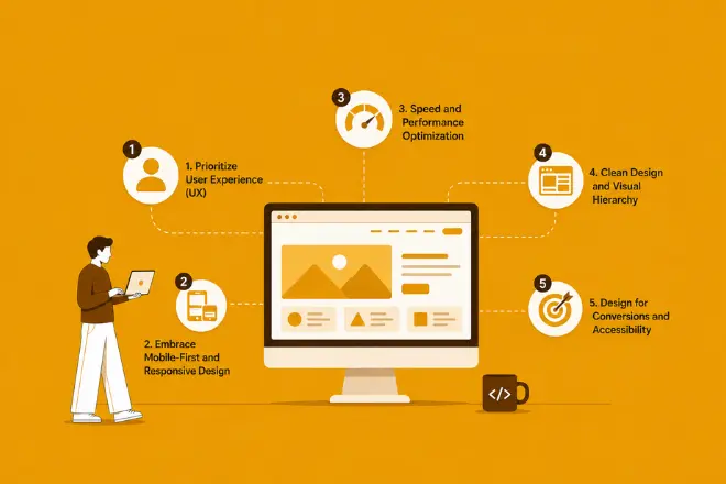
Here are the five golden rules of web design that every business must follow to stop losing customers and start winning them.
At a glance, here are the five rules and why each one matters:
| Rule | Principle | Why It Matters |
|---|---|---|
| 1 | Prioritize User Experience (UX) | Reduce friction, increase engagement and conversions |
| 2 | Mobile-First Responsive Design | Reach the 60%+ of traffic coming from mobile devices |
| 3 | Speed and Performance Optimization | Every 1-second delay costs up to 7% in conversions |
| 4 | Clean Design and Visual Hierarchy | Guide users to your most important content and CTAs |
| 5 | Conversion Focus and Accessibility | Turn visitors into customers without excluding anyone |
Rule 1: Prioritize User Experience (UX) Above Everything
There is a tempting logic in web design that says: make it beautiful and they will come. Businesses pour budgets into custom illustrations, animated gradients, and bold typography, only to watch visitors bounce in seconds because they could not find the navigation menu.
User experience is not about aesthetics. It is about how a person feels navigating your site. Can they find what they came for? Does every click feel predictable? Is the journey from ‘I am interested’ to ‘I have purchased’ as frictionless as possible?
Research consistently shows that 88% of online users are less likely to return to a site after a bad experience. That is nearly nine out of every ten first-time visitors you might permanently lose to a confusing navigation menu or a form that resets when an error occurs.
| UX Element | Common Mistake | Best Practice |
|---|---|---|
| Navigation | Too many menu items | Limit to 5-7 top-level items with clear labels |
| Forms | Too many required fields | Ask only for what you need, use inline validation |
| CTA Buttons | Generic text like ‘Click here’ | Action-oriented text like ‘Start your free trial’ |
| Content Layout | Dense paragraphs | Short paragraphs, clear headers, plenty of whitespace |
| Error Messages | Vague technical jargon | Plain language explaining exactly what went wrong |
Digital transformation has shifted the design conversation from what looks good to what works well. The two are not mutually exclusive, but when forced to choose, function wins every time.
Rule 2: Embrace Mobile-First and Responsive Design
In 2026, more than 60% of all global web traffic comes from mobile devices. In markets like India or the US, that number climbs even higher, with smartphone browsing accounting for over 75% of internet usage. Designing for desktop first and then trying to squeeze it into a phone is designing for the minority.
Mobile-first design flips the process. You start with the smallest screen, the toughest constraints, and the most distracted user. If your design works on a 390-pixel-wide phone screen, scaling it up to a tablet and a desktop is straightforward. The reverse is rarely true.
The SEO connection: Google has used mobile-first indexing since 2019, meaning it evaluates your site’s mobile version to determine search rankings. A website that looks great on desktop but breaks on mobile is not just losing mobile users. It is losing search visibility entirely.
Practical mobile-first checklist:
- Design layouts for screens starting at 375px wide
- Ensure all tap targets are at least 44px by 44px
- Test navigation with one thumb, not a mouse
- Compress images to load fast on 4G connections
- Use system fonts or limit custom font weights to reduce load
A responsive site does not just resize. It rethinks. A three-column desktop layout might become a single-column stack on mobile. A hover-triggered dropdown might become a tap-to-expand accordion. The goal is never to shrink your desktop site. It is to rebuild it for how mobile users actually behave.
Rule 3: Focus on Speed and Performance Optimization
Here is the number that changes minds in every boardroom: a one-second delay in page load time can reduce conversions by up to 7%. For a business generating 1000 USD per day online, that one second costs over 2500 USD a month. Speed is not a technical preference. It is a revenue metric.
Google’s Core Web Vitals, the performance standards that directly influence search rankings, give us clear benchmarks. Here is how your site should perform:
| Metric | Poor | Average | Good (Target) |
|---|---|---|---|
| Page Load Time | > 5 seconds | 3 to 5 seconds | Under 2 seconds |
| Time to First Byte (TTFB) | > 1.8 seconds | 0.8 to 1.8 seconds | Under 0.8 seconds |
| Largest Contentful Paint (LCP) | > 4 seconds | 2.5 to 4 seconds | Under 2.5 seconds |
| Cumulative Layout Shift (CLS) | > 0.25 | 0.1 to 0.25 | Under 0.1 |
| First Input Delay (FID) | > 300ms | 100 to 300ms | Under 100ms |
Reaching these benchmarks requires a disciplined approach to performance. Images are usually the first culprit, and switching to modern formats like WebP can cut file sizes by 30 to 50% compared to JPEG. Content Delivery Networks (CDNs) serve your assets from servers geographically close to each user, shaving hundreds of milliseconds off every load. Caching ensures returning visitors do not re-download what they have already seen.
The goal is simple: get the user to their content before their attention wanders. In 2026, that window is measured in seconds.
Rule 4: Maintain Clean Design and Visual Hierarchy
Open two websites side by side. One has five different font sizes, three competing banner ads, an autoplay video in the corner, and a colour palette that seems to have been chosen at random. The other has generous whitespace, a clear headline, one prominent call-to-action button, and a visual flow that guides your eye naturally from top to bottom. Which one feels trustworthy? Which one do you believe can actually help you?
Visual hierarchy is the design principle that answers ‘what should the user look at first, second, and third?’ Without it, every element competes for attention equally, which means nothing stands out and users leave without acting.
Whitespace is not wasted space. Research from the Nielsen Norman Group has found that introducing whitespace between paragraphs and in the left and right margins increases comprehension by almost 20%. Empty space gives the eye somewhere to rest and the brain time to process.
Key elements of clean, hierarchical design:
- One primary CTA per page, visually dominant and action-oriented
- A maximum of two to three typefaces across the entire site
- Consistent colour usage where your brand colour signals ‘click here’
- Headlines at least 2x larger than body text to establish scanning hierarchy
- Sufficient contrast ratios (minimum 4.5:1 for normal text) for legibility
Minimalism in web design is not about removing features. It is about removing everything that competes with the one thing you most want users to do.
Rule 5: Design for Conversions and Accessibility
A website that is beautiful, fast, and well-organised is still a failure if it does not convert. Conversion-focused design starts with a question: what is the single most important action I want a visitor to take on this page? Every design decision then serves that answer.
But in 2026, conversion and accessibility are no longer separate discussions. They are the same discussion. The World Health Organization estimates that 1.3 billion people globally live with some form of disability. In the US alone, that is over 26 million people. A website that is not accessible is a website that has pre-emptively turned away a significant portion of its potential audience.
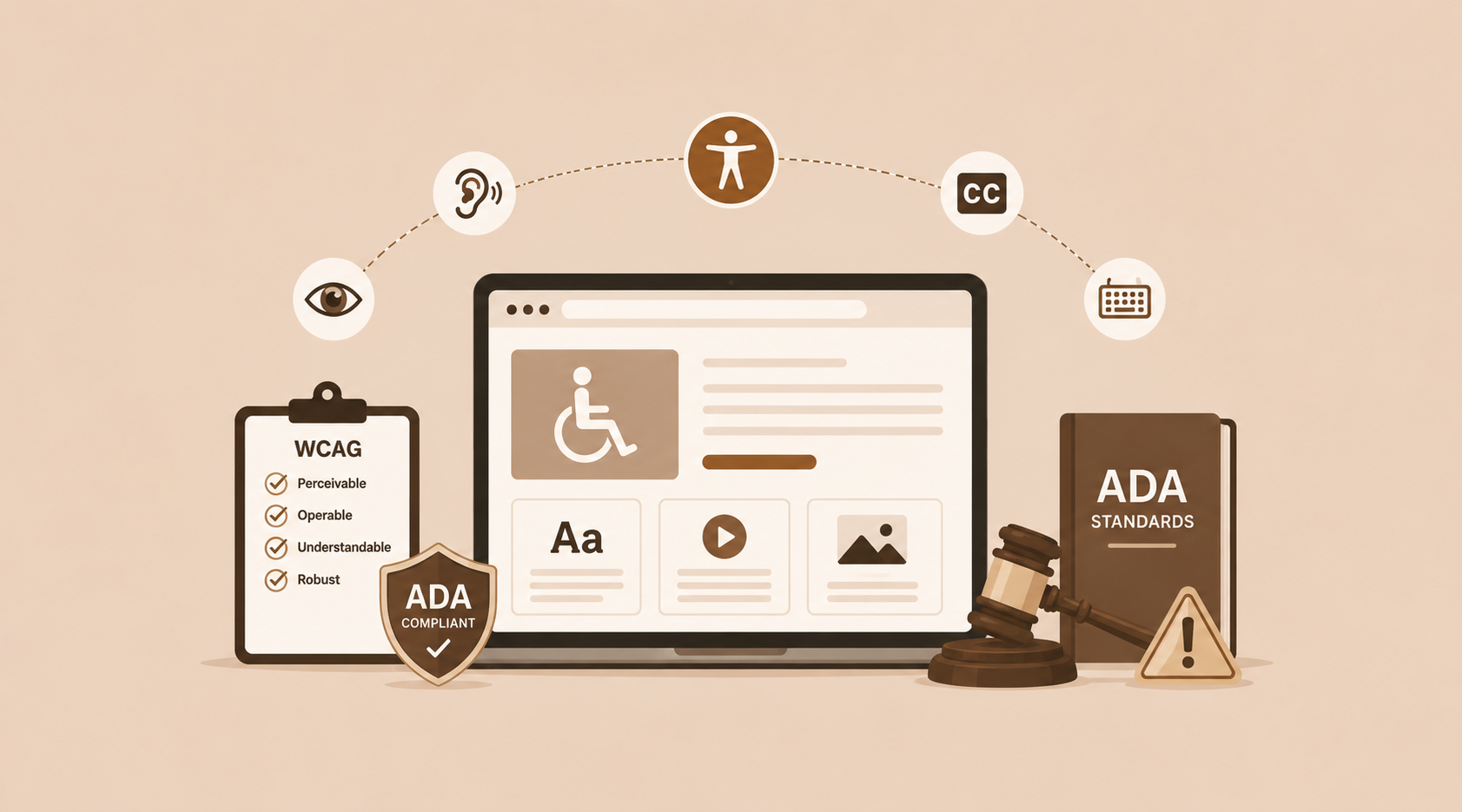
The Web Content Accessibility Guidelines (WCAG) provide the global standard. Meeting WCAG 2.1 AA compliance is not just good ethics. It is increasingly a legal requirement in markets including the EU, the UK, and the United States.
Accessibility and conversion overlap more than most designers realise. Clear button labels help both screen reader users and users who are simply scanning quickly. High colour contrast helps both people with visual impairments and people reading on a bright screen outdoors. Keyboard navigability helps both users with motor disabilities and power users who prefer not to use a mouse.
Conversion and accessibility checklist:
- Place your primary CTA above the fold on every key landing page
- Write button text that describes the action: ‘Download the guide’ not ‘Submit’
- Add descriptive alt text to every non-decorative image
- Ensure the entire site is navigable using only a keyboard
- Use WCAG-compliant colour contrast ratios for all text
- Test with real users, including those who use assistive technologies
The Business Case: What Happens When You Follow These Rules
The five rules above are not abstract design philosophy. They produce measurable results. Here is what the research says:
| Design Improvement | Measured Business Impact |
|---|---|
| Improving UX design quality | Up to 400% increase in conversion rate (Forrester Research) |
| Switching to mobile-first responsive design | 67% of users more likely to buy from mobile-friendly sites |
| Reducing page load time by 1 second | Up to 7% increase in conversions |
| Implementing clean visual hierarchy | Nearly 20% improvement in content comprehension |
| Meeting WCAG accessibility standards | Access to an additional 1.3 billion potential users globally |
Conclusion: Design Is Not Decoration. It Is Strategy
In 2026, the businesses winning online are not necessarily the ones with the biggest teams or the largest ad budgets. They are the ones who understand that their website is a system, and every element of that system either helps or hurts the user on their way to becoming a customer.
Follow these five golden rules. Prioritise how users feel, not just how pages look. Design for the phone first. Load fast, always. Create clarity, not clutter. And build a website that every person, regardless of ability, can use with confidence.
Design is the strategy. Build it like you mean it.








 +91-7982030802
  +1(315) 585-1155